Search
Make Good Use of Your Sidebar

Use this space for anything from simple blocks of text to powerful widgets, like our Twitter and Flickr widgets. Learn more.

To access Website Management, hit the 'esc' key or use this Login link.

Tuesday
Jun162015

The "NU" Whitney Museum of American Art 


The New Whitney Museum of American Art 

What an exciting time for all things NU! We were super excited to visit the new Whitney Museum of American Art last week for the first time. The space felt expansive and airy. We loved the multiple outdoor spaces allowing for wonderful views of downtown and the Hudson. The lens of the debut exhibit focused on the primary or fundamental pieces from the museums permanent collection, making them feel fresh and NU in this excitingly wonderful space. 

Neil G. Bluhm, president of the Board of Trustees of The Whitney Museum of American Art, said in regards to the new building "When I look at this extraordinary museum, I see the future of the Whitney and the future of art”.  

Though the doors have only been open since May 1st of this year, the Museum has already generated conversations among art critics and tourists alike. At its new location the Whitney shares a block with the southern entrance of the High Line in the meatpacking district of Lower Manhattan. Far from coincidental the architect, Renzo Piano knew that this precise location would generate a constant stream of traffic in front of the Whitney.

The first floor of the building is free to the public and offers a gift shop, café, and the first section of the galleries.  It is enclosed almost entirely in glass, which allows the general public a peek of what’s happening on the inside.  The new Whitney provides a new answer to the question of the Art Museum’s role in today’s society. The building serves as a meca for social engagement, intellectual stimulation, sightseeing, and of course- the appreciation of art.

The first exhibit on view is titled “America Is Hard To See”. It features artwork produced in The United States from 1900 to present, and all pieces were taken from the Whitney’s permanent collection. The exhibit is set up chronologically, the goal being to expose the ever-changing attitudes and opinions of the artists in America.  While it does follow a timeline, it is also cleverly grouped by room in a way that exposes the messages of the pieces individually and as a whole.  The curators did not shy away from the tougher subject matter, which is refreshing in the “white-wall” gallery setting. The fifth floor features rooms such as “Love Letter From The War Front”, a collection of work that speaks about the AIDS epidemic of the 1980’s, and “Threat And Sanctuary”, which offers a sampling of experimental painting methods in the 60’s and 70’s.

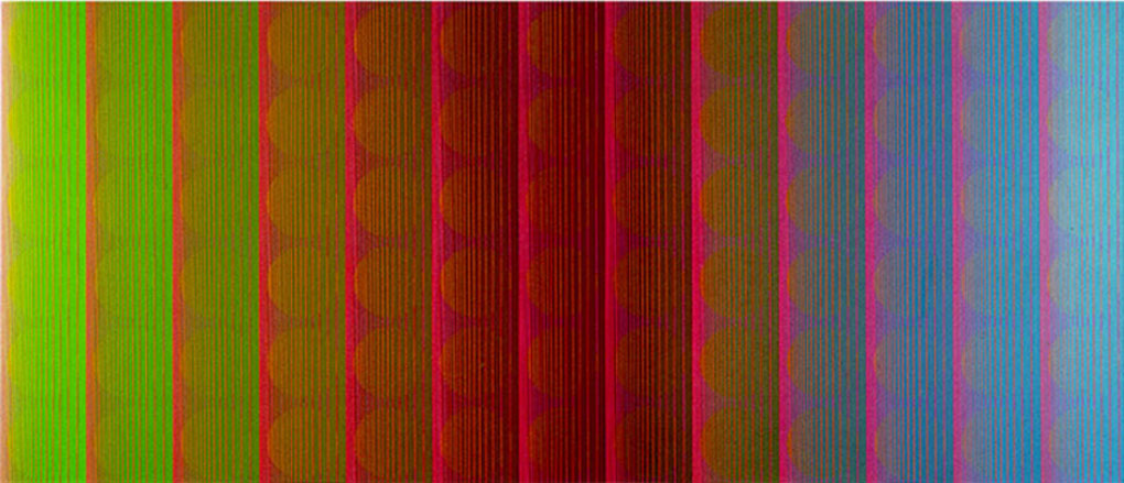
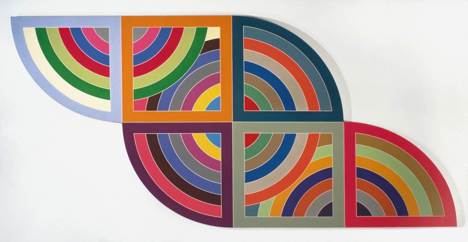
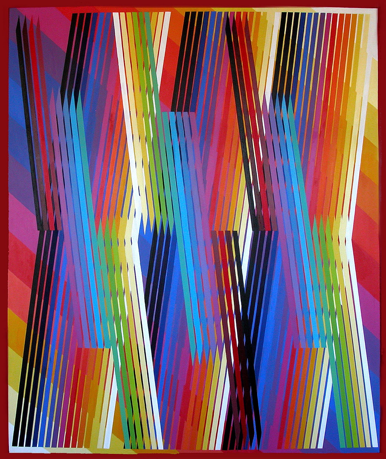
Drawing inspiration from the exhibit, here are some of our favorites!


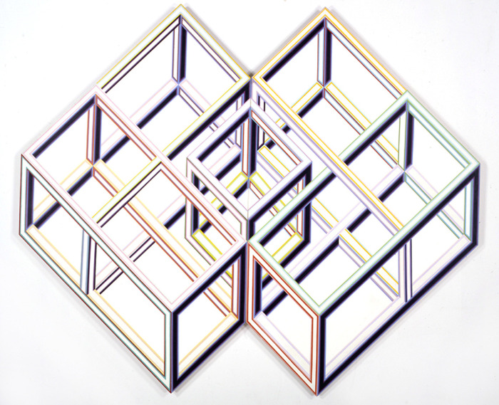
 Alvin Loving, Rational Irrationalism, 1969

We love how Loving layered the open cubes and juxtaposed warm and cool colors to create an optical play on three dimensionality on a flat supposrt. Lovings work gained significant attention in the 1960's. He became the first Afrian American artist to receive a one person show at the Whitney.

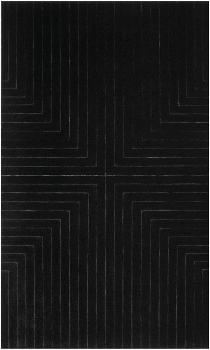
Mark Bradford, Bread and Circuses, 2007

This mixed media piece caught our eye immediately, and not just because of it's size- which is 11ft tall and over 21ft wide! The texture and layering are incredible.

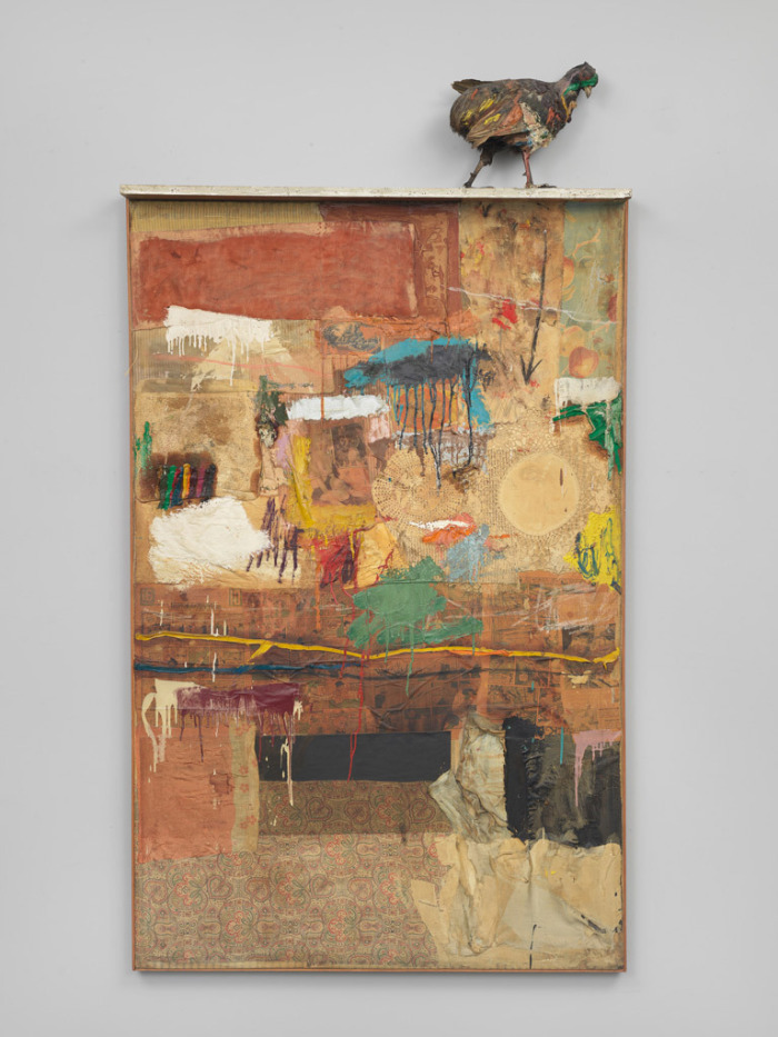
Robert Rauschenberg, Satellite, 1955

Rauschenberg is perhaps best known for his "combines"- a self coiled term referring to his unique mixture of sculpture and painting. We took note of this awesome 60's color scheme.

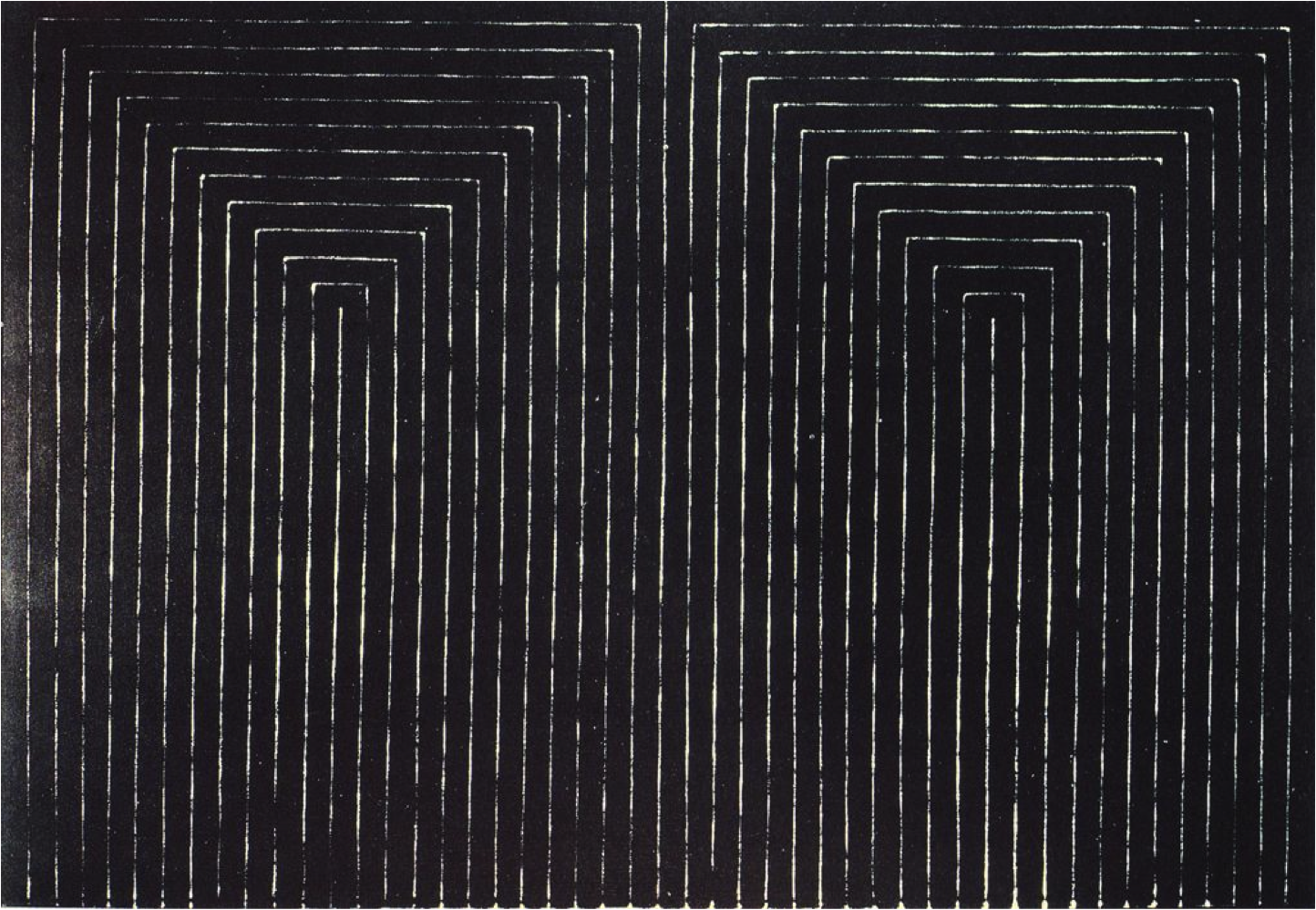
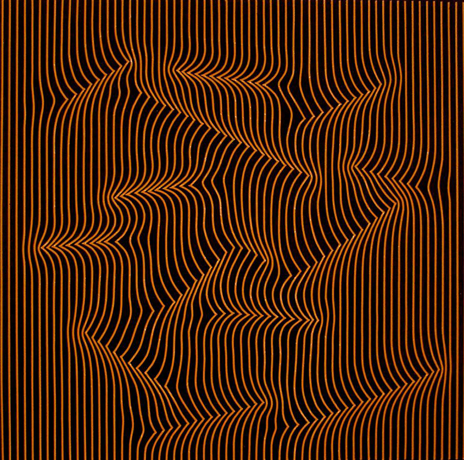
Frank  Stella, Die Fahne Hoch!, 73" x 121.5"

It was great to see this Frank Stella piece in person too! Stella's work has a brooding energy that we love. From his color block work to his black and white paintings, we are loving all things Stella.

Tuesday
Jun092015

Op Art: The amplification of life's experiences, a study of perception

Ecliptic, Julian Stanczak, 1970

“Op Art”, an artistic movement focused on optical illusions, began in the 1960’s.  Artists such as Frank Stella, Ed Mieczkowski, and Julian Stanczak were fascinated with the study of perception.

The Marriage of Reason and Squalor, II, Frank Stella, 1959


Harran II, Frank Stella, 1967

Frank Stella’s “Black Paintings” served as a separation from the emotional Abstract Expressionists before him.  Stella’s work is not personal. Instead, he positioned himself as a nonrepresentational painter focused on the principles of design.  He created the “Black Paintings” by carefully applying house paint to the canvas in parallel lines with minute white spaces between the stark black strokes.  By choosing to paint the negative space as opposed to th positive, the figure-ground relationship within the work becomes more complex.  As Stella’s body of work evolved he transitioned into painting multicolor shapes, using color theory to accentuate the apperance of illusion in the work.  The shapes were painted in a color-block fashion and carefully filled with advancing and receding colors. While the compositions in works such as Harran II offer the viewer a vast depth of field, Stella contradicts this illusion by cutting the canvas flush to the shapes which flattens the dimentional work. 


Fanfare, Ed Mieczkowski, 2007

Ed Mieczkowski was one of the three founding fathers of the artist collective “Anonima”, along Frank Hewitt and Ernst Benkert. The group was dedicated to the research and teaching of drawing practices focused on dimensional geometric shapes.  Mieczkowski’s work, like Stella’s later paintings, uses the study of color to create the illusion of space.

Uninterupted Brown, Julian Stanczak, 2005

The Op Art movement credits Julian Stanczak for its name, an adaptation from the title of his 1964 show Julian Stanczak: Optical Paintings.  Stanzak’s work has a stronger sense of movement than Stella and Mieczkowski.  He exercises a different color theory principle- vibrating colors. Stanczak’s fine line paintings each have their own unique set of color palettes that push the boundaries of illusion, ultimately creating the appearance of movement. In his artist statement he claims that his art "does not echo the natural world. It does not detail visual experiences. His art does what art is supposed to do, it amplifies life’s experiences". 

Wednesday
Nov192014

Decon City, Rearranging the Threads  

Gunta Stolz, the Bauhaus weaving master applied ideas from modern art to weaving, creating complex colorful compositions of geometric forms. She experimented with different materials and techniques to create a new weaving style and was fundamental in establishing weaving as an artistic medium. Her rythmic structural works involve many patterns and grid-like abstract forms.

From a Vouge Italia article on the Bauhaus movement, " "The medium is the message," wrote Marshall Mcluhan in 1967: an aesthetic motto according to which the medium was way more relevant than the message tied to it.  This rule had already been widely developed, between 1919 and 1933, by the Bauhaus current: a movement that was capable of including architecture, graphics, sculpture and painting, mixing them between them, as to achieve the highest and most complete result

The movement developed in factories, each of which was owned by prominent names. Among these one is particularly worth noting: Gunta Stolz, who managed, until 1931, the Bauhaus textile workshop. If needle and thread were the most irremovable standards for women's work, that had always, with no change, been handed down from mother to daughter, the movement did not seem intimidated by it and paved its meticulous work of deconstruction. The openness of the director allowed to liberate textures from the prejudices of the patriarchal setting, moving them towards highly technological horizons. The revived and almost forgotten concept of tekne, an art capable of bringing together an ancient language, the future, and a substantial system creative know-how, was shaped according to new convictions. While Gunta's laboratory was overshadowed by the most famous architectural and graphic ones, ironically it became the most profitable. Among the pieces appeared well-made rugs, tapestries and fabrics which, also thanks to their reasonable price, were easily placed in European homes. Made as if they were melodies, using the frame as if were a music sheet, the yarns required complex steps, each of which called for a specialized figure, like that of a textile designer, a figure that born in those years, and that for a long time it belonged to the multifaceted artist Anni Albers. " Read the full article @ www.vogue.it/en/encyclo/textiles/b/bauhaus

Similarly, Nigel Peake's illustrations capture his fascination with built structures and observations of life. His meditative drawings are influenced by his training as an architect. They capture details and parts of his observances and are pieced together to form a sort of tapestry of patterns. A video of him drawing is below.

Another artist Steven Vasquez Lopez is also interested in this meditative style of drawing. His work, based on woven plaids is focused on line and texture. His manually intensive process involves drawing each "thread" to create a plaid pattern. He said "It's all math, and I have to just count in my head the pattern while placing each colored line onto the page at one time... It's meticulous and laborious."

Tuesday
Oct072014

Hermés Festival de Métiers

Did you know it takes over two years and more than 40 dedicated artisans to complete a Hermés scarf? Recently the fashion house hosted its Festival de Métiers, or “Festival of Crafts.” It highlights their talented artisans and honors their handmade tradition of luxury goods craftsmanship. “Nothing has changed in twenty years,” a veteran shirtmaker said at the London show.  

Printmakers screen scarves, some using up to 47 colors, which means 47 screens. Other craftspeople set diamonds for jewelry, work leather bags, or paint ceramic pieces. Hermés doesn’t outsource or replace humans for machines, so bringing its workshop to the public shows the level of skill, time and detail that go into the work - and also justifies the high price.  

The exhibit was most recently in Sydney Australia, presented in a contemporary setting designed by acclaimed Milanese industrial designer Paola Navone. Festival des Métiers has previously been exhibited in London, Shanghai, Beijing, New York and Paris.

See the video below of the artisans screenprinting at the Hermes Festival de Métiers at the Saatchi Gallery in London.

Festival de Métiers from PORT on Vimeo.


Wednesday
Oct012014

Bohemian Goddesses


Bohemian style — expressive, rebellious, and romantic — brings to mind a time of freedom, love, and creativity. Today we want to honor a few of our most beloved bohemian goddesses, whose free-spirited expression helped them through adversity. 

“Veruschka is the most beautiful woman in the world,” Richard Avedon said of the model and sixties icon. Born a countess, she reinvented herself after coming to New York after her father was killed and her family left refugees after WWII. Liberated by fashion she embodied a fierce independent spirit.

Marisa Berenson was dubbed “the it girl of the Seventies” by Yves Saint Laurent. Grandaughter of the designer Schiaparelli, her modeling career began early when her baptism was covered by Vogue. No stranger to tragedy in her own life she has been on a spiritual quest since the age of 12, at one point studying with the Beatles’ guru in India. A close friend of Warhol and also known as “Queen of the Scene” she embodied the eccentric original bohemian muse, Marchesa Casati. 

Casati wore live snakes as jewelry, and had nude male servants gilded in gold. She was quoted as saying “I want to be a living work of art.” Her love of her pet cheetahs inspired Cartier’s famed designs. Left an orphan in her teens she refused to conform to the aristocratic Italian society, and became one of the most eccentric, avant-garde and inspiring women of her century.